Nexmobile
Redesigning the end-to-end experience in Nexmobile, NexgenRx’s benefit claims app for iOS and Android.
Client
NexgenRx
Year
2020
Jump to

Information Architecture
User Experience
User Research & Usability Testing
Visual Design and Prototyping
Responsibilities
NexgenRX is a Canadian provider of group benefit plans. Through their Nexmobile app, members can submit real-time and image claims and check their benefit usage.
Overview
With the redesign of their web portal, they wanted to revamp Nexmobile for the following reasons;
Reduce the number of crashes
Improve the UX of the claim submission process
Align the mobile interface with the new web platform for a more cohesive brand identity.
How do you validate your work with end users when your client is resistant to you talking to their users?
User research
The results of the survey, combined with my review of user feedback in the app stores, helped focus my design direction and gave me more insight into common user complaints. Using this information I developed a proto-persona to guide the design.
As the stakeholders were reluctant to facilitate user interviews, I reached out to their customer support team. As they didn’t have any documentation to draw on, I developed a short survey and sent it out to their team, receiving 10 responses.
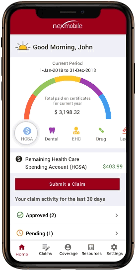
One of my primary goals was to give users a snapshot of their benefit usage, healthcare spending account (HCSA) amount and status of submitted claims on the homescreen.
Wireframes
Usability Testing
By doing guerrila user-testing, our team was able to resolve a disagreement with the stakeholders, on the styling of the primary CTA, the “Submit a claim” button.
To resolve this, I asked each person on my internal team to recruit 1-2 particiants from their family and friends. This resulted in 8 participants.


After pooling together our responses and analyzing the responses, I realize that the staleholders were rght to be concerned. I addressed this by moving the CTA to the middle of the screen with a clear and descriptive label.
Using Sketch to create the visuals and Invision for the prototype, I created high-fidelity mock-ups to help the stakeholders get the look and feel of the final app.
Visual design
My work on this app directly contributed to NexgenRX gaining a huge client, the International Union of Operating Engineers. Based in Ontario, the union has 17,000+ members.
Outcome
Nexmobile was developed to be fully white-labelled, allowing NexgenRx to adapt for future customers.
By changing the colour palette and logos, the prototype was used as a sales tool for NexgenRx to attract new customers.
Reduction in calls for customer support staff.
Outcomes
When circumventing stakeholders for user-research, the customer support team can be a great resource.
There can never be too much detail when communicating with developers. Be as literal as possible.
Lessons